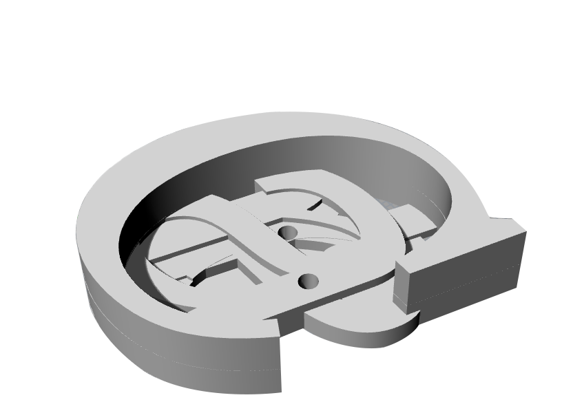
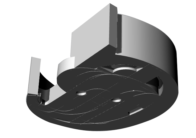
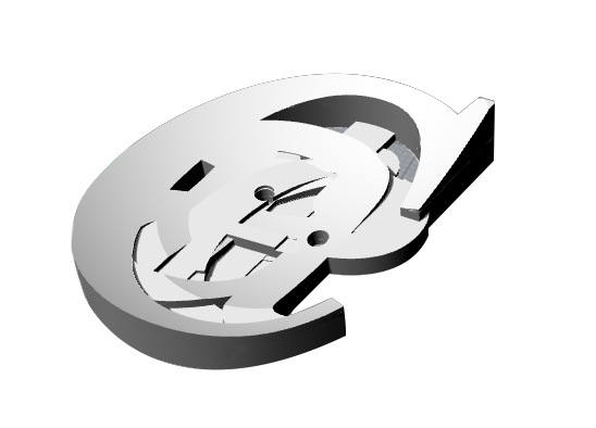
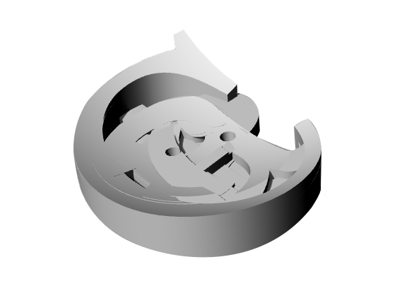
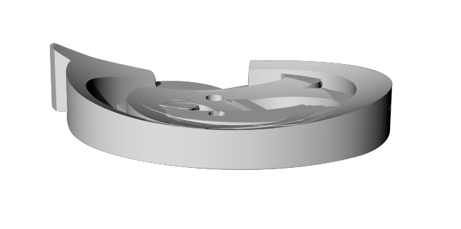
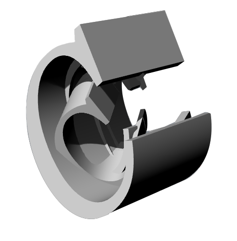
As a design experiment in Rhino , the goal was to create a button for Cartier. Since their logo is an italic script, I wanted to play with the letters in a more modern manner as some of their recent jewelry designs have been highlighting. This brand has been around for well over 100 years, and so the idea of time condensed into a piece was the motivation with these experimental designs. Whether it be the reading of the letters over time and condensing them into a 3D form from 4D time / space, or the idea of the C in Cartier existing in time in a non-linear manner in which the first letter carries itself thru space/time, almost like how the Italian futurists illustrated movement.